Learning management system
Create, manage & deploy your microlearning formations.

Introduction
MonkeeSuite is the LMS (Learning Management System) of Yoomonkeez, a training organization based in Angers, where I worked for a year in 2021 and 2022. When I joined, the LMS had been online for 4 months.
How to integrate a UX Design approach into an LMS that was built without one?
Since the project was developed internally the previous year and, at that time, there was no UX Designer in the company, my role was to integrate a UX Design approach into this LMS that had been built without one.
Design goal
Clarify the various actions available to the user and simplify the interfaces as much as possible, while reducing visual clutter and respecting technical constraints.
Company goal
Quickly deliver a more user-friendly version and reduce the number of users dropping out when creating a course.
Expected Deliverables
New interfaces for all platform screens:
- Dashboard
- User space
- Course creation
- Course distribution
- Statistics space
Context and Information Architecture
Before starting the project, I began by assessing the current state.
What are the main actions of the LMS? How are they highlighted for users? How are they linked together? What are the technical constraints of the LMS?
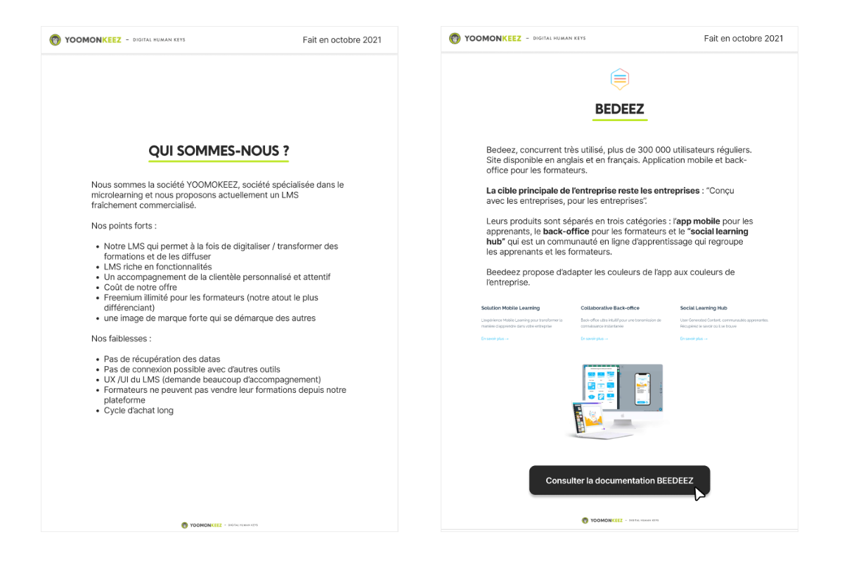
Competitive Analysis
Once the assessment was completed, I needed to get a precise understanding of the market to see where we stood and how our competitors positioned themselves. This step was crucial. I carried it out before starting the project to ensure I had as much information as possible in mind in order to make coherent proposals.
Project Organization
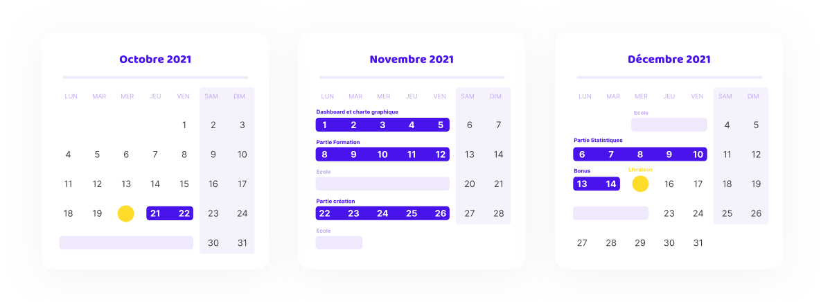
With the project deadline being very tight (1.5 months) and the workload heavy, it was necessary to establish a rigorous organization to ensure the project proceeded smoothly. That's why I set up a schedule on Jira.
Setting up Work sessions
Since Yoomonkeez had never had a UX Designer before, I implemented work processes adapted to the business challenges. I started by organizing technical meetings with the company’s two developers, Kevin Morin and Logan Lamoureux, to regularly confirm the feasibility of my proposals. These meetings helped me identify and resolve blocking points before the feedback phase with decision-makers (for which I scheduled regular validation and feedback meetings).
Art Direction
In terms of art direction, I created two different proposals based on the homepage: one proposal close to the existing design and another with a light theme, using a more moderate application of the company’s brand colors. Due to time constraints and because the structure of the first proposal was similar to the existing page, the first one was selected and adapted across all the mockups.
Design
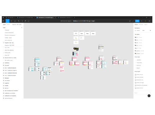
I applied the selected art direction to the 32 key pages of the platform, only restructuring those pages that lacked clarity the most.
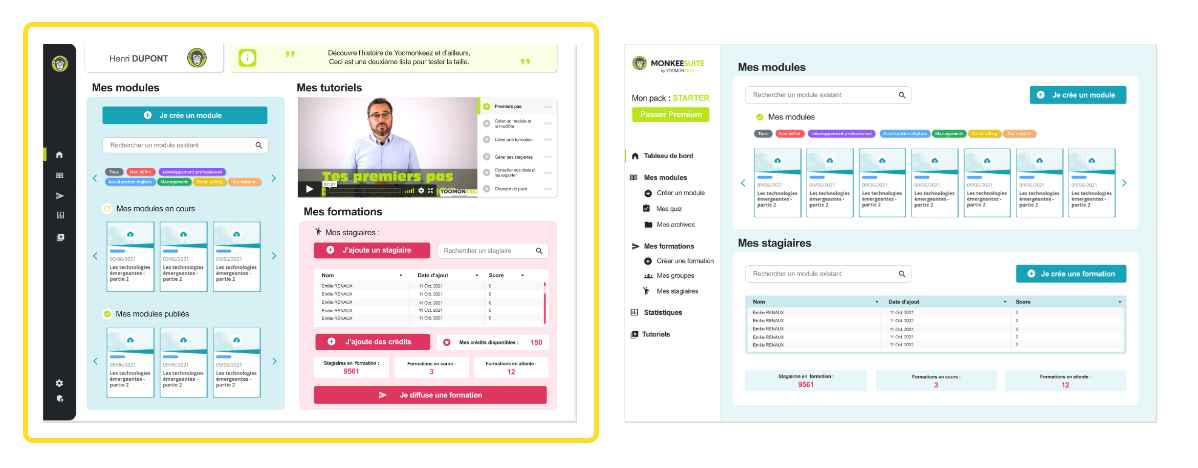
Focus on the Course Creation Section Below is a detailed view of the course addition page, showing the previous interface. This so-called “course addition” page is actually a course distribution management page. It allows the user to choose how they will distribute their course, on which days, at what time, to whom, and with what options.
Conclusion
This project was very interesting and allowed me to learn about the consequences of technical and UX debt, as well as how to implement solutions to minimize their impact on users. The challenging deadlines required very detailed organization, which I managed through Jira (for task tracking) and Notion (for writing the project brief and overall process).
If you are curious about what I do, feel free to write me an email at bouvet.eniluap@gmail.com.